GEO-511 Semester Project
Modeling the relationship between community solar projects and the incentives in the US.
Austin Izzo
Introduction
With the expansion of solar energy throughout the United States in the past year, community solar projects have become increasingly popular. Community solar projects often consist of a partnership between the public, government entities and the business sector to install solar energy throughout a community. The outcomes of such programs can be prosperous for all entities involved. Although a seemingly common sense solution to part of the nation’s energy challenge, community solar projects are a relatively new concept and spatial trends in where these projects are taking place.
Research Question: In this analysis, the goal will be to identify what role financial incentives play in the installment of projects in the US.
Materials & Methods
- Load any required packages:
#Load neccessary Libraries
library(dbplyr)
library(jsonlite)
#install.packages("xml2")
library(xml2)
library(readr)
#install.packages("readxl")
library(readxl)
library(sf)
library(ggplot2)
library(sf)
library(tidyverse)
#install.packages("spData")
library(spData)
#install.packages("maps")
library(maps)
library(formattable)
library(knitr)
library(kableExtra)- Download and clean all required data. Creating seperate tables for each source of data
- NREL - list of the community solar projects
- DSIRE (Database of State Incentives for Renewable Energy) - Multiple tables with data relating to solar power incentives
- spData package - Basemaps of US
#Load in all of the DSIRE datasets
NREL_url <- "https://data.nrel.gov/files/114/NREL_Community_Solar_Project_List_6_28_2019%20FINAL.xlsx"
NREL_path <- "NREL_Community_Solar_Project_List_6_28_2019FINAL.xlsx"
NREL_Data <- read_xlsx(NREL_path, sheet = 2)
names(NREL_Data) <- c("Project", "City", "State", "Utility", "Size(kWh)","Year","Latitude", "Longitude")

Harvard_url <- "https://dataverse.harvard.edu/api/access/datafile/:persistentId?persistentId=doi:10.7910/DVN/VOQCHQ/FQ9NBF"
Harvard_Data <- read_tsv(Harvard_url)

state_geom<- map_data("state")

DSIRE_program <- read_csv("https://raw.githubusercontent.com/geo511-2019/2019-geo511-project-austin3087/master/program.csv")
DSIRE_parameter_set <- read_csv("https://raw.githubusercontent.com/geo511-2019/2019-geo511-project-austin3087/master/parameter_set.csv")
DSIRE_parameter <- read_csv("https://raw.githubusercontent.com/geo511-2019/2019-geo511-project-austin3087/master/parameter.csv")
DSIRE_state <- read_csv("https://raw.githubusercontent.com/geo511-2019/2019-geo511-project-austin3087/master/state.csv")
names(DSIRE_state)<- c("state_id", "abbreviation", "name", "is_territory")
DSIRE_program_tech <- read_csv("https://raw.githubusercontent.com/geo511-2019/2019-geo511-project-austin3087/master/program_technology.csv")
DSIRE_technology <- read_csv("https://raw.githubusercontent.com/geo511-2019/2019-geo511-project-austin3087/master/technology.csv")
DSIRE_technology_category <- read_csv("https://raw.githubusercontent.com/geo511-2019/2019-geo511-project-austin3087/master/technology_category.csv")- Join the DSIRE datasets
Data Structure Representation
#Join the DSIRE datasets by their relevant keys creating one "Final" table with relevant information. See data relationship chart above to identify how tables are related.
DSIRE_program2 <- inner_join(DSIRE_program,DSIRE_state, by = "state_id")%>%
  inner_join(DSIRE_parameter_set, by = c("id" = "program_id"))%>%
  inner_join(DSIRE_parameter, by = c("id" = "parameter_set_id"))%>%
  inner_join(DSIRE_program_tech, by = c("id" = "program_id"))%>%
  inner_join(DSIRE_technology, by = c("technology_id" = "id"))
DSIRE_program_final <- inner_join(DSIRE_program2, DSIRE_technology_category, by = c("technology_id" = "id"))- Identify total count & mean value of awarded $ of solar incentives per state
#Filter table for solar photovoltaics
DSIRE_program_table <- DSIRE_program_final%>%
  filter(is_entire_state == 1)%>%
  filter(name.x.x == "Solar Photovoltaics")%>%
  filter(is_territory == 0)
kwh_total_state <- DSIRE_program_table%>%
  group_by(name.y)%>%
   summarize(Total = n())
names(kwh_total_state)<- c("State","Total")
kwh_total_state$State <- tolower(kwh_total_state$State)

kwh_mean_state <- DSIRE_program_table%>%
  group_by(name.y)%>%
  filter(units == "$")%>% #note only using $ values that are given, multiple other units given too in table but needed to be filtered for this analysis
  summarize(Total = mean(amount))
names(kwh_mean_state)<- c("State", "Average")
kwh_mean_state$State <- tolower(kwh_mean_state$State)- Create custom themes (with and without legend)
#Create Custom theme
theme_black_blank<- theme(
    panel.background = element_rect(fill = "transparent"), # bg of the panel
    plot.background = element_rect(fill = "#222222", color = "#222222"), # bg of the plot
    panel.grid.major = element_blank(), # get rid of major grid
    panel.grid.minor = element_blank(), # get rid of minor grid
    legend.background = element_rect(fill = "transparent"), # get rid of legend bg
    legend.box.background = element_rect(fill = "transparent"), # get rid of legend panel bg
    panel.border = element_blank(),
    axis.title = element_blank(),
    axis.text = element_blank(),
    axis.line = element_line("transparent"),
    legend.position = "none"

)- Create spatial distribution plot to identify locations of projects
#Plot just Community Locationsadd state geometry to DSIRE data to plot
plot1 <- ggplot()+
  geom_polygon(data = state_geom, aes(x = long, y = lat, group = group ), fill = '#222222', col = "#ba5454")+
  coord_fixed(ratio = 1.2)+
  geom_point(NREL_Data, mapping = aes(x = Longitude , y = Latitude, alpha = .85), col = "#6ca2b8")+
theme_black_blank- Plot Spatial Distribution along w/ shaded mean incentive per state
DSIRE_program_table2 <- full_join(kwh_mean_state, state_geom, by = c("State" = "region"))

plot2 <- ggplot()+
  geom_polygon(data = DSIRE_program_table2, aes(x = long, y = lat, group = group, fill = Average), col = "#ba5454")+
  coord_fixed(1.2)+
  geom_point(NREL_Data, mapping = aes(x = Longitude , y = Latitude), col = "#6ca2b8", alpha = .8)+
  theme_black_blank+
scale_fill_gradient(low = "#496692", high = "#000E23")- Plot spatial distribution along w/ shaded quantity incentives per state
DSIRE_program_table3 <- full_join(kwh_total_state, state_geom, by = c("State" = "region"))

plot3 <- ggplot()+
  geom_polygon(data = DSIRE_program_table3, aes(x = long, y = lat, group = group, fill = Total), col = "#ba5454")+
  coord_fixed(1.2)+
  geom_point(NREL_Data, mapping = aes(x = Longitude , y = Latitude), col = "#6ca2b8", alpha = .8)+
  theme_black_blank+
scale_fill_gradient(low = "#496692", high = "#000E23")- Create Scatter plot of Average Incentive Provided vs Total # of Installations
theme_black_scatter<- theme(
    panel.background = element_rect(fill = "transparent"), # bg of the panel
    plot.background = element_rect(fill = "#222222", color = "#222222"), # bg of the plot
    panel.grid.major = element_blank(), # get rid of major grid
    panel.grid.minor = element_blank(), # get rid of minor grid
    legend.background = element_rect(fill = "transparent"), # get rid of legend bg
    legend.box.background = element_rect(fill = "transparent"), # get rid of legend panel bg
    panel.border = element_blank(),
    axis.title.x = element_text(color = "white"),
    axis.title.y = element_text(color = "white"),
    axis.line = element_line(color = "white"),
    axis.text.x = element_text(color = "white"),
    axis.text.y = element_text(color = "white"),
    legend.position = "none",
    plot.title = element_text(color = "white", hjust = 0.5),
    axis.ticks = element_line(color = "white")
)

Total_per_state <- group_by(DSIRE_program_table2, State)%>%
  dplyr::summarise(Total =  n())

DSIRE_program_table4 <- full_join(kwh_mean_state, Total_per_state, by = c("State" = "State")) %>%
  filter(Average < 20000)

plot4<- ggplot(DSIRE_program_table4)+
  geom_point(aes(x = Average, y = Total), col = "#6ca2b8") +
  theme_black_scatter +
  labs(title = "Average Incentive vs Number of Installations")+
  ylab("Total Number of Installations")+
xlab("Average Incentive ($)")- Create Scatter plot of Total # of Incentives vs Total # of Installations
DSIRE_program_table5 <- full_join(kwh_total_state, Total_per_state, by = c("State" = "State"))
names(DSIRE_program_table5) <- c("","Total_Incentive", "Total_Installation")

plot5<- ggplot(DSIRE_program_table5)+
  geom_point(aes(x = Total_Incentive, y = Total_Installation), col = "#6ca2b8") +
  theme_black_scatter +
  labs(title = "Total Number of Incentives vs Number of Installations")+
  ylab("Number of Installations")+
  xlab("Total Number of Incentives")
Results
Spatial Plots
Spatial Distibution of Community Solar Installations
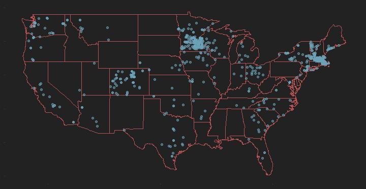 Goal: Identify spatially where the installations exist.
Description: This plot displays community solar installations across the US.
Data Source: This data was retrieved from NREL.
Spatial Distibution of Community Solar Installations w/ Incentives shaded per $
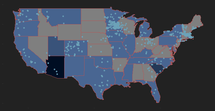 Goal: Identify spatial relationship on where more money is awarded for incentives.
Description: This plot displays community solar installations across the US, with state shading representing money awarded for solar incentives. A larger amount of money provided through solar incentives is equal to a darker color.
Data Source: This data was retrieved from NREL & DSIRE database.
Spatial Distibution of Community Solar Installations w/ Incentives shaded per quantity
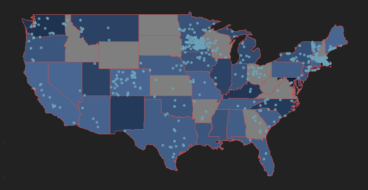 Goal: Identify spatial relationship on where more money is awarded for incentives.
Description: This plot displays community solar installations across the US, with state shading representing total number of solar incentives available. A larger number of solar incentives is equal to a darker color.
Data Source: This data was retrieved from NREL & DSIRE database.
Scatter Plots
Scatter Plot Comparing Number of Community Solar Installations w/ Average Incentive Value - Provided by NREL & DSIRE data
*Note: Average Incentive > 20,000 excluded 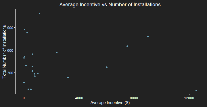 Goal: Identify relationship between number of solar installations and incentive value.
Description: By comparing both number of solar installations and average incentive value we are able to identify if there is a clear trend relating both factors.
Data Source: This data was retrieved from NREL & DSIRE database.
Scatter Plot Comparing Number of Community Solar Installations w/ Number of Incentives - Provided by NREL & DSIRE data
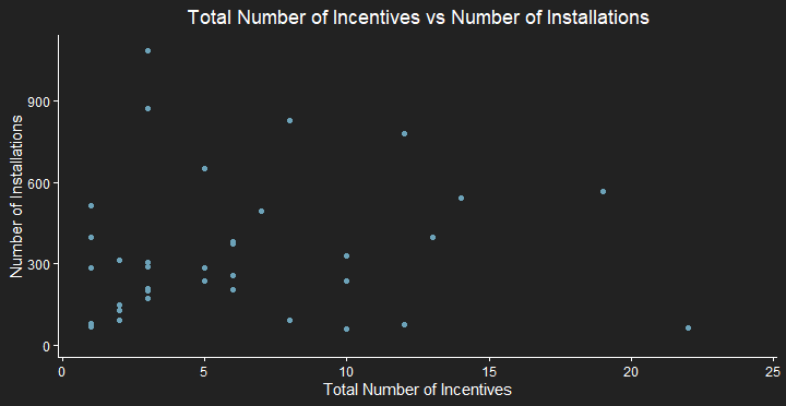 Goal: Identify relationship between number of solar installations and number of incentives.
Description: By comparing both number of solar installations and number of incentives we are able to identify if there is a clear trend relating both factors.
Data Source: This data was retrieved from NREL & DSIRE database
Conclusion
After the analysis of the community solar projects was completed a couple conclusions could be made.
1 - There was no clear correlation between the amount of money awarded for incentives and the amount of community solar projects present in a given state. As seen in the first scatter plot, displaying the number of projects vs the amount of money awarded, it is evident many of the states having a higher number of projects did not have a higher value of money awarded to them. This is expected since more frequent, lower value incentives are given will create a higher number (most likely also smaller in size) number of systems.
2 - Although, not a clear trend there appears to be more correlation between number of incentives and number of installations. The second scatter plot shows this trend, showing a higher density of number of installations for values states with less than 10 incentives.