COPMARISON OF DIFFERENT CLIMATE DATASETS
Nima Masoudvaziri, Zolal Ayazpour
Introduction
When studying atmospheric-related phenomena, one may use observations (like data from weather stations) or simulated datasets based on numerical models. Also, one may want to investigate and explore a phenomenon or behavior which has happened already in the past, or may be interested in prediction of an event or behavior. As a result, different datasets should be incorporated given the nature of the study. Essentially, there are three types of models: Forecast, Analysis and Reanalysis. Forecast models are comprised of physics-based equations and propogate an atmospheric state forward in time, i.e. given the vaules of different parameters at time t, one can calculate the values for time t+dt. Analysis basically does the same thing, however instead of the prediction by physics, it takes place by statistical methods. In other words, given the observations at some locations, one can come up with an estimation for different parameters at locations that there is no observation available. There are different physics-based models and also different assumptions and methodologies in data assimilation, which experience modifications along the time. Besides, instrumnetation also changes as time passes and technology improves. Reanalysis takes all these variations into account and yield a comprehensive and coherent dataset over the globe. It is supposedly the best dataset for looking into the past weather. More infomation can be found here.
Definition of the Problem
For this study, among different publicly available models, two will be considered. The main objective of the work is to compare their dataset for temperature as a primary climatological variable, within both temporal and spatial scopes. One of the models is called High Resolution Rapid Refresh (HRRR) which is a forecast model (with forecast length of 18 hours) generating data to a 3-km resolution grid, hourly. More information about HRRR can be find here. The other model to use is ERA5 which is a climate reanlysis dataset of up to 3 month before with 30-km resolution at an hourly frequency. More information about ERA5 dataset can be found here. Summary of the models are provided in the following table.
| Model | Type | Resolution | Frequency |
|---|---|---|---|
| HRRR | forecast | 3 km | hourly |
| ERA5 | reanlaysis | 30 km | hourly |
The main reason for choosing these two models is that one of them has a significantly higher resolution and, on the other hand, the other is supposedly based on a more powerful model.
Materials and Methods
Materials
Each model has its own archive and support, accessible by public. HRRR data can be found following this instruction, and ERA5 can be downloaded following this instruction. Also, observations from weather stations can be found from NOAA LCD Tool.
Methods
The output of HRRR and ERA5 are summarized in GRIB2 and NetCDF formats, respectively. Considering the State of New York as the case study, the output of both models are loaded in the working directory for one year (2018). They are meteorological datasets, including precipitation, temperature, wind, and snow, which are mapped at specific grid cells. Among these variables, temperature is studied in this project. Using the raster package, the output dataset of both models can be read. Dealing with spatial datasets, in addition to raster package, sf and sp packages are also useful to manage the data. In order to work with the introduced data, first, the hourly datasets are aggregated to produce data at daily and monthly temporal resolution, and their statistical characteristics are calculated. In the next step, the output of both models are visualized as timeseries over the year 2018 to demonstrate their temporal behavior over the time, and they are compared with the weather station dataset as a verification data source. Furthermore, to compare two models spatialy, the output dataset of each model are mapped over the same grid cells. As a result, two raster objects are produced projecting values of temperature on the same grid cells. The difference between both datasets are visualized by mapping the difference over the case study and the monthly average, minimum and maxmimum temperature are plotted applying plotting tools.
Packages
Here is the required packages for this project.
library(raster)     # managing rasters
library(rgdal)      # managing rasters
library(sf)         # managing rasters
library(lubridate)  # managing date formats
library(dplyr)      # managing data
library(ggplot2)    # plots
library(ggpubr)     # plots
library(rasterVis)  # plots
library(viridisLite)# plots
library(xts)        # timeseries plots
library(dygraphs)   # timeseries plots
library(gridExtra)  # timeseries plots
library(rnoaa)      # NOAA data
library(png)        # load png


knitr::opts_chunk$set(cache=TRUE)  # cache the results for quick compiling
Preprocessing
This figure illustrates the framework of this study to preprocess the data provided by HRRR and ERA5 models.
img <- readPNG("./Data/Framework.png")
grid::grid.raster(img)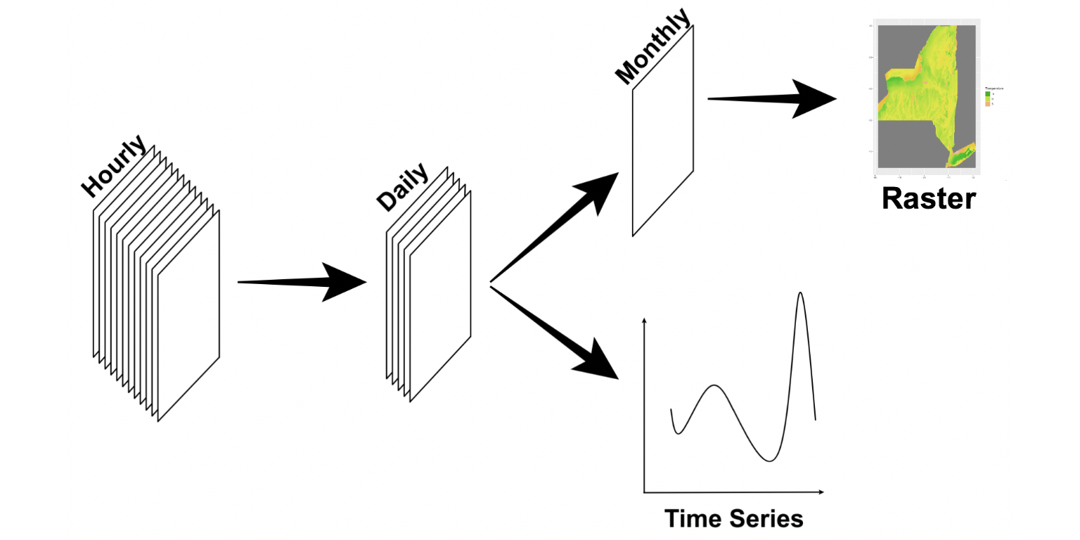
The following code loads the ERA5 data and preprocesses them, creating the rasters and dataframes that we need for visualization and analysis. Each file of this dataset contains 24 rasters (correponding to 24 hours of a day) for the variable that you specify. User should input the year, name of the variable, coordinates of the weather station and directory of the files.
runn=F
if(runn){
  Yr<- 2018
  par<- 'skt'     # the variable you are interested in,
                  # and you have it available on your disk

  xy= cbind(-78.7358, 42.9408)  # Coordinates of the weather station
                                # this is Buffalo's Niagara International Airport

  # This data frame will be used for time-series plots
  daily_df= data.frame(Date= as.Date(character()),
                       Mean= numeric(),
                       Min= numeric(),
                       Max= numeric(),
                       stringsAsFactors = FALSE)
  monthly_bricks= list()
  monthly_mean= list()
  monthly_min= list()
  monthly_max= list()

  for(y in c(Yr)){
    for(M in 1:12){
      month_path= paste0('PATH TO THE FILES','/Y',Yr,'/M',
                         sprintf("%02d", as.numeric(M)),'/')
      ls= list.files(month_path, recursive = TRUE)
      l= length(ls)
      n= nrow(daily_df)
      everyday_bricks= list()


    for(i in c(1:l)){
      f_name= paste0(month_path,ls[i])
      day_brick= brick(f_name, varname= par)
      daily_df[n+i,1]= as.Date(substr(f_name,nchar(f_name)-10,nchar(f_name)-3), "%Y%m%d")
      daily_df[n+i,2]= extract(calc(day_brick, mean), xy, method='simple')
      daily_df[n+i,3]= extract(calc(day_brick, min), xy, method='simple')
      daily_df[n+i,4]= extract(calc(day_brick, max), xy, method='simple')

      everyday_bricks[i]= day_brick
    }
    # Rasters below will be used to generate maps.
    monthly_bricks[M]= brick(everyday_bricks)
    monthly_mean[M]= calc(monthly_bricks[[M]],mean)
    monthly_min[M]= calc(monthly_bricks[[M]],min)
    monthly_max[M]= calc(monthly_bricks[[M]],max)
    }
  }
}
The following code loads the HRRR data and preprocesses them, creating the rasters and dataframes that we need for visualization and analysis. Each file of this dataset contains a raster (correponding to an hour of a day) for the variable that you specify. Again, user should input the year, name of the variable, coordinates of the weather station and directory of the files.
runn=F
if(runn){
  Yr<- 2018
  par<- 'TMP_surface'     # the variable you are interested in,
                          # and you have it available on your disk

  xy= cbind(-78.7358, 42.9408)  # Coordinates of the weather station
                                # this is Buffalo's Niagara International Airport

  ny <- extent(-81, -70, 39.5, 46) # bounding box of the New York State

  # This data frame will be used for time-series plots
  for(Y in c(Yr)){
    daily_df= data.frame(Date= as.Date(character()),
                        Mean= numeric(),
                        Min= numeric(),
                        Max= numeric(),
                        stringsAsFactors = FALSE)
    monthly_bricks= list()
    monthly_mean= list()
    monthly_min= list()
    monthly_max= list()

    for(M in c(1:12)){
      data_path= paste0(getwd(),'/')
      month_path=paste0('HRRRfromPando_',Y,sprintf("%02d", as.numeric(M)))
      par_path=paste0(par)
      ls= list.files(data_path,month_path)
      ls=ls[grep(par_path,ls)]
      l= length(ls)/24
      n= nrow(daily_df)
      everyday_bricks=list()

      for(D in c(1:l)){
        day_path=paste0(month_path,sprintf("%02d", as.numeric(D)))
        ls_day= ls[grepl(day_path,ls)]
        l_hr=length(ls_day)
        day_list=list()

        for(hr in c(1:l_hr)){
          file_path=paste0(data_path,ls_day[hr])
          day_list[hr]=try(raster(file_path),silent=TRUE)
        }

        for(fn in day_list){
          if (is.character(fn)){
            day_list[which(day_list==fn)]=NULL
          }
        }

      day_brick=brick(day_list)

      f_name= paste0(day_path)

      daily_df[n+D,1]= as.Date(substr(f_name,nchar(f_name)-7,nchar(f_name)), "%Y%m%d")
      daily_df[n+D,2]= extract(calc(day_brick, mean), xy, method='simple')
      daily_df[n+D,3]= extract(calc(day_brick, min), xy, method='simple')
      daily_df[n+D,4]= extract(calc(day_brick, max), xy, method='simple')

      everyday_bricks[D]= day_brick
      }

      # Rasters below will be used to generate maps.
      monthly_bricks[M]= brick(everyday_bricks)
      monthly_mean[M]= crop(projectRaster(
        calc(monthly_bricks[[M]],mean),crs="+proj=longlat +datum=WGS84 +ellps=WGS84
        +towgs84=0,0,0"), ny)
      monthly_min[M]= crop(projectRaster(
        calc(monthly_bricks[[M]],min),crs="+proj=longlat +datum=WGS84 +ellps=WGS84
        +towgs84=0,0,0"), ny)
      monthly_max[M]= crop(projectRaster(
        calc(monthly_bricks[[M]],max),crs="+proj=longlat +datum=WGS84 +ellps=WGS84
        +towgs84=0,0,0"), ny)
    }
  }
}
Visualiziation of HRRR and ERA5
The output of both models are plotted over the New York State in October 2018, as an example, to show their different spatial resolution.
us <- st_read("./Data/tl_2017_us_state/tl_2017_us_state.shp")

ny_bound <- us %>%
  filter(STUSPS=="NY")

#Raster
monthly_mean_ERA5= list()
monthly_min_ERA5= list()
monthly_max_ERA5= list()
monthly_mean_HRRR= list()
monthly_min_HRRR= list()
monthly_max_HRRR= list()
monthly_mean_HRRR_resample=list()
monthly_min_HRRR_resample=list()
monthly_max_HRRR_resample=list()
monthly_mean_Diff=list()
monthly_min_Diff=list()
monthly_max_Diff=list()

for (M in c(1:12)){
  monthly_mean_ERA5[M] = raster(paste0(getwd(),'/Data/monthly_mean_ERA5_',M,'.tif'))
  offs(monthly_mean_ERA5[[M]])=-273.15
  monthly_min_ERA5[M] = raster(paste0(getwd(),'/Data/monthly_min_ERA5_',M,'.tif'))
  offs(monthly_min_ERA5[[M]])=-273.15
  monthly_max_ERA5[M] = raster(paste0(getwd(),'/Data/monthly_max_ERA5_',M,'.tif'))
  offs(monthly_max_ERA5[[M]])=-273.15

  monthly_mean_HRRR[M] = raster(paste0(getwd(),'/Data/monthly_mean_HRRR_',M,'.tif'))
  monthly_min_HRRR[M] = raster(paste0(getwd(),'/Data/monthly_min_HRRR_',M,'.tif'))
  monthly_max_HRRR[M] = raster(paste0(getwd(),'/Data/monthly_max_HRRR_',M,'.tif'))

  monthly_mean_HRRR_resample[M] <- resample(monthly_mean_HRRR[[M]],monthly_mean_ERA5[[M]],method="bilinear")
  monthly_min_HRRR_resample[M] <- resample(monthly_min_HRRR[[M]],monthly_min_ERA5[[M]],method="bilinear")
  monthly_max_HRRR_resample[M] <- resample(monthly_max_HRRR[[M]],monthly_max_ERA5[[M]],method="bilinear")

  monthly_mean_Diff[M] <- monthly_mean_HRRR_resample[[M]]-monthly_mean_ERA5[[M]]
  monthly_min_Diff[M] <- monthly_min_HRRR_resample[[M]]-monthly_min_ERA5[[M]]
  monthly_max_Diff[M] <- monthly_max_HRRR_resample[[M]]-monthly_max_ERA5[[M]]
}

# comparing resolutions
# p1=gplot(mask(crop(monthly_mean_HRRR[[10]],extent(ny_bound)),ny_bound))+
#   geom_tile( aes( fill=value ) )+
#   scale_fill_continuous(type='viridis',name="Temperature")+
#   xlab(NULL)+
#   ylab(NULL)+
#   ggtitle('HRRR (3 km)')
p1<- levelplot(mask(crop(monthly_mean_HRRR[[10]],extent(ny_bound)),ny_bound),
          col.regions=viridis, margin=F, main=list('HRRR (3 km)'))

p2<- levelplot(mask(crop(monthly_mean_ERA5[[10]],extent(ny_bound)),ny_bound),
          col.regions=viridis, margin=F, main=list('ERA5 (30 km)'))

ggarrange(p1,p2,nrow=1)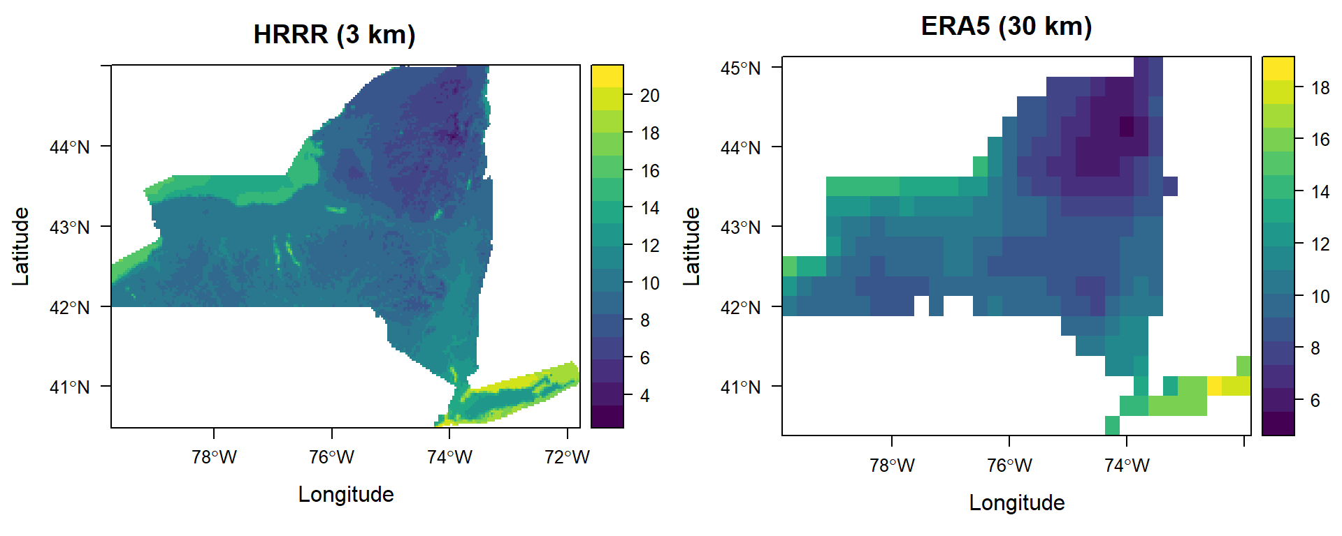
Resample from fine to coarse, or coarse to fine?
Working with series of datasets with different spatial resolutions, this is an important question which needs to be wisely answered. Resampling from coarse resolution to finer one means generating artificial data which increases the uncertainty and inaccuracy in the problem. On the other hand, resampling from fine resolution to coarser one smoothes out data which can make difference in the model quality. This question can be answered in different ways based on the application of the data after processing.
The figure below shows the difference between two models in both resampling scenarios, from fine to coarse (on left: difference between resampled HRRR raster and its corresponding ERA5 raster) and from coarse to fine (on right: difference between resampled ERA5 and its corresponding HRRR raster). Since ERA5 model ended up yielding better results in this study, we concluded to maintain ERA5 dataset without changes, and hence, HRRR model is resampled over the ERA5 grid cells.
# comparing resample methods (from fine to coarse and vise versa)
HRRR_to_ERA5_resample <- resample(monthly_mean_HRRR[[10]],monthly_mean_ERA5[[10]],method="bilinear")
monthly_mean_Diff_1 <- HRRR_to_ERA5_resample-monthly_mean_ERA5[[10]]

ERA5_to_HRRR_resample <- resample(monthly_mean_ERA5[[10]],monthly_mean_HRRR[[10]],method="bilinear")
monthly_mean_Diff_2 <- monthly_mean_HRRR[[10]]-ERA5_to_HRRR_resample

p1<- levelplot(mask(crop(monthly_mean_Diff_1,extent(ny_bound)),ny_bound),
          col.regions=viridis, margin=F, main=list('Difference by resampled HRRR'))

p2<- levelplot(mask(crop(monthly_mean_Diff_2,extent(ny_bound)),ny_bound),
          col.regions=viridis, margin=F, main=list('Difference by resampled ERA5'))

ggarrange(p1,p2,nrow=1)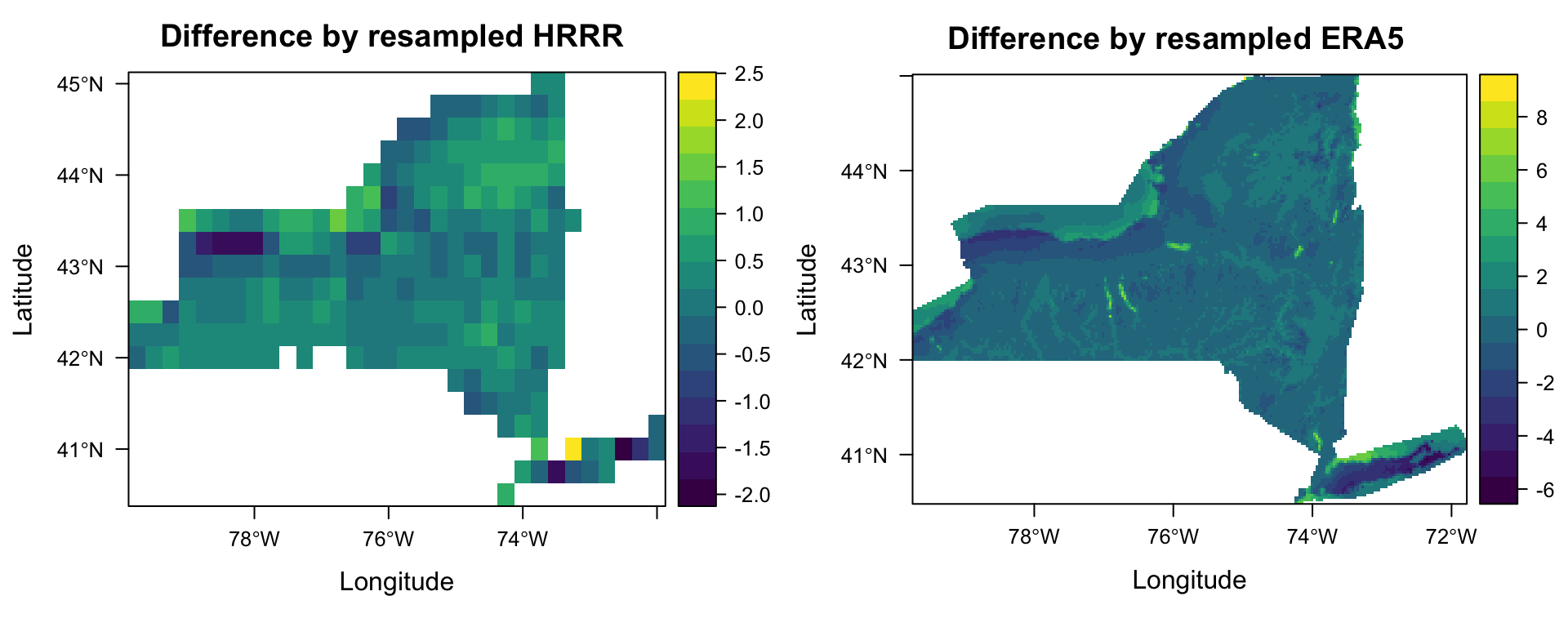
Results
Timeseries are plotted for Buffalo, NY for daily average, minimum and maximume temperature. In addition, difference between HRRR and ERA5 models are visualized on the map over the New York state for monthly average, minimum and maximum Temperature.
HRRR_df <- read.csv2(paste0('./Data/daily_df_HRRR.csv'))
ERA5_df <- read.csv2(paste0('./Data/daily_df_ERA5.csv')) %>%
  mutate(Mean=Mean-273.15,Min=Min-273.15,Max=Max-273.15)

station_df=meteo_tidy_ghcnd("USW00014733",
                            date_min = "2018-01-01",
                            date_max = "2018-12-31",
                            var = c("TMAX","TMIN","TAVG"),
                            keep_flags=T) %>%
  select(c(2,12:14)) %>%
  mutate(tavg=tavg/10,tmin=tmin/10,tmax=tmax/10) %>%
  mutate(date=as.Date(date)) %>%
  select(c(1,2,4,3))

dfs<- data.frame(Date=as.Date(0:364, origin='2018-01-01'),
                 Mean=numeric(365),
                 Min=numeric(365),
                 Max=numeric(365))
for(i in 1:nrow(station_df)){
  dfs[i,2:4]=station_df[i,2:4]
}

p_h_avg <- ggplot()+
  geom_line(data=HRRR_df, aes(x=as.Date(HRRR_df[,2]), y=HRRR_df[,3], color='HRRR'))+
  geom_line(data=dfs, aes(x=as.Date(dfs[,1]), y=dfs[,2], color='Station'))+
  labs(title='Average Temperature: HRRR vs Weather Station',
       x='Date', y= 'Temperature [C]', colour='Data Source')+
  scale_color_manual(values= c('firebrick','royalblue'),
                     labels = c("HRRR", "Station"),
                     guide = "legend")

p_h_min <- ggplot()+
  geom_line(data=HRRR_df, aes(x=as.Date(HRRR_df[,2]), y=HRRR_df[,4], color='HRRR'))+
  geom_line(data=dfs, aes(x=as.Date(dfs[,1]), y=dfs[,3], color='Station'))+
  labs(title='Minimum Temperature: HRRR vs Weather Station',
       x='Date', y= 'Temperature [C]', colour='Data Source')+
  scale_color_manual(values= c('firebrick','royalblue'),
                     labels = c("HRRR", "Station"),
                     guide = "legend")
p_h_max <- ggplot()+
  geom_line(data=HRRR_df, aes(x=as.Date(HRRR_df[,2]), y=HRRR_df[,5], color='HRRR'))+
  geom_line(data=dfs, aes(x=as.Date(dfs[,1]), y=dfs[,4], color='Station'))+
  labs(title='Maximum Temperature: HRRR vs Weather Station',
       x='Date', y= 'Temperature [C]', colour='Data Source')+
  scale_color_manual(values= c('firebrick','royalblue'),
                     labels = c("HRRR", "Station"),
                     guide = "legend")

p_e_avg <- ggplot()+
  geom_line(data=ERA5_df, aes(x=as.Date(ERA5_df[,2]), y=ERA5_df[,3], color='ERA5'))+
  geom_line(data=dfs, aes(x=as.Date(dfs[,1]), y=dfs[,2], color='Station'))+
  labs(title='Average Temperature: ERA5 vs Weather Station',
       x='Date', y= 'Temperature [C]', colour='Data Source')+
  scale_color_manual(values= c('limegreen','royalblue'),
                     labels = c("ERA5", "Station"),
                     guide = "legend")
p_e_min <- ggplot()+
  geom_line(data=ERA5_df, aes(x=as.Date(ERA5_df[,2]), y=ERA5_df[,4], color='ERA5'))+
  geom_line(data=dfs, aes(x=as.Date(dfs[,1]), y=dfs[,3], color='Station'))+
  labs(title='Minimum Temperature: ERA5 vs Weather Station',
       x='Date', y= 'Temperature [C]', colour='Data Source')+
  scale_color_manual(values= c('limegreen','royalblue'),
                     labels = c("ERA5", "Station"),
                     guide = "legend")
p_e_max <- ggplot()+
  geom_line(data=ERA5_df, aes(x=as.Date(ERA5_df[,2]), y=ERA5_df[,5], color='ERA5'))+
  geom_line(data=dfs, aes(x=as.Date(dfs[,1]), y=dfs[,4], color='Station'))+
  labs(title='Maximum Temperature: ERA5 vs Weather Station',
       x='Date', y= 'Temperature [C]', colour='Data Source')+
  scale_color_manual(values= c('limegreen','royalblue'),
                     labels = c("ERA5", "Station"),
                     guide = "legend")

grid.arrange(p_h_avg,p_e_avg,
             p_h_min,p_e_min,
             p_h_max,p_e_max,
             nrow=3)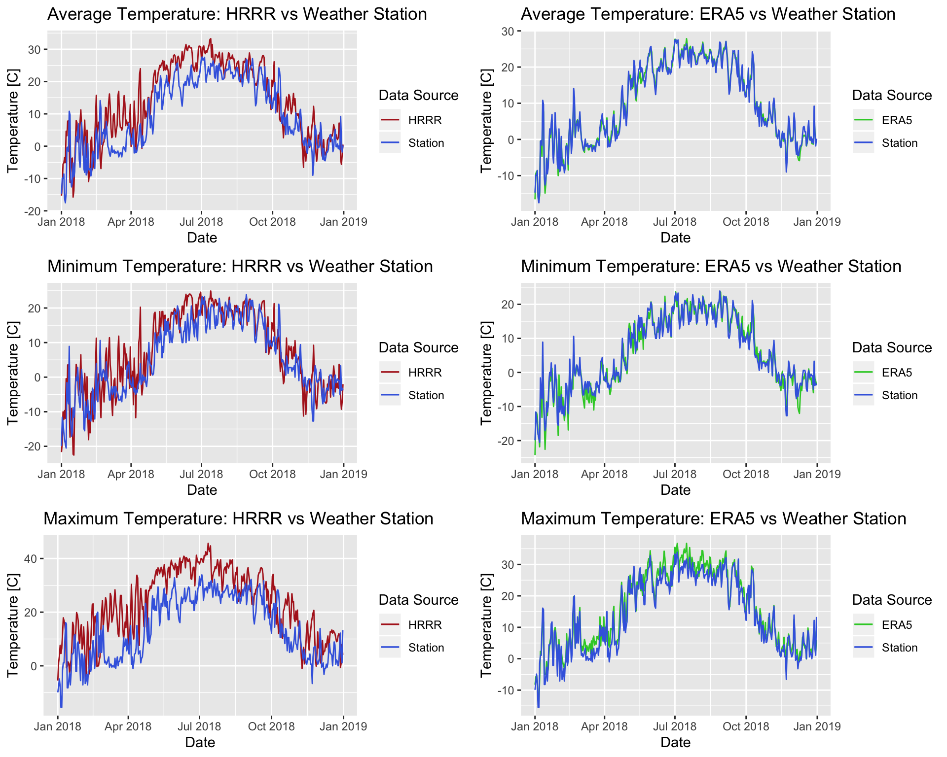
# Plots<- list()
# for(i in c(1:3)){
#   for(j in c(1:2)){
#     p = ggplot()+
#       geom_line(data=ls_df[[j]], aes(x=as.Date(ls_df[[j]][,2]), y=ls_df[[j]][,(i+2)]),
#                 color=ls_color[j])+
#       geom_line(data=dfs, aes(x=as.Date(dfs[,1]), y=dfs[,(i+1)]),
#                 color=ls_color[3])
#     Plots[[(i-1)*2+j]] = p
#     print((i-1)*2+j)
#   }
# }
# grid.arrange(grobs=Plots, nrow=3)
ts_mean<- xts(cbind(station_df$date,HRRR_df$Mean,ERA5_df$Mean,station_df$tavg),
order.by=station_df$date)
dygraph(ts_mean[,c(2:4)],main="Daily Average Temperature in Buffalo, NY") %>%
dySeries("V1",label="HRRR") %>%
dySeries("V2",label="ERA5") %>%
dySeries("V3",label="Weather Station") %>%
dyRangeSelector(dateWindow=c("2018-01-01", "2018-12-31")) %>%
dyOptions(colors=c("indianred","mediumseagreen","royalblue"))Difference between HRRR and ERA5 - Monthly Average Temperature
# rasters of difference between HRRR and ERA5 (3x12)
ls_names=c("Jan","Feb","Mar","Apr","May","Jun","Jul","Aug","Sep","Oct","Nov","Dec")

monthly_mean_Diff_brick=brick(monthly_mean_Diff)
names(monthly_mean_Diff_brick)=ls_names
levelplot(mask(monthly_mean_Diff_brick,ny_bound),
          col.regions=viridis)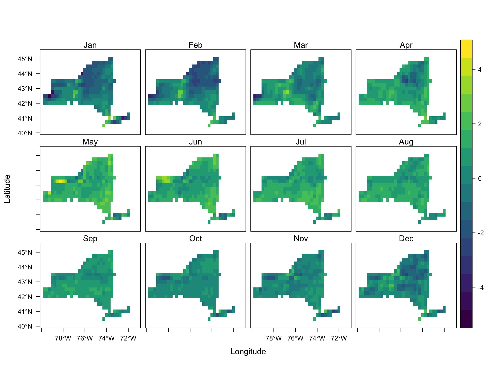
# gplot(mask(monthly_mean_Diff_brick,ny_bound))+
#   geom_tile( aes( fill=value ) )+
#   scale_fill_continuous(type='viridis',name="Temperature")+
#   xlab(NULL)+
#   ylab(NULL)+
#   facet_wrap(~ variable)
# plot(mask(monthly_mean_Diff_brick,ny_bound),nr=4)
Difference between HRRR and ERA5 - Monthly Minimum Temperature
monthly_min_Diff_brick=brick(monthly_min_Diff)
names(monthly_min_Diff_brick)=ls_names
levelplot(mask(monthly_min_Diff_brick,ny_bound),
          col.regions=viridis)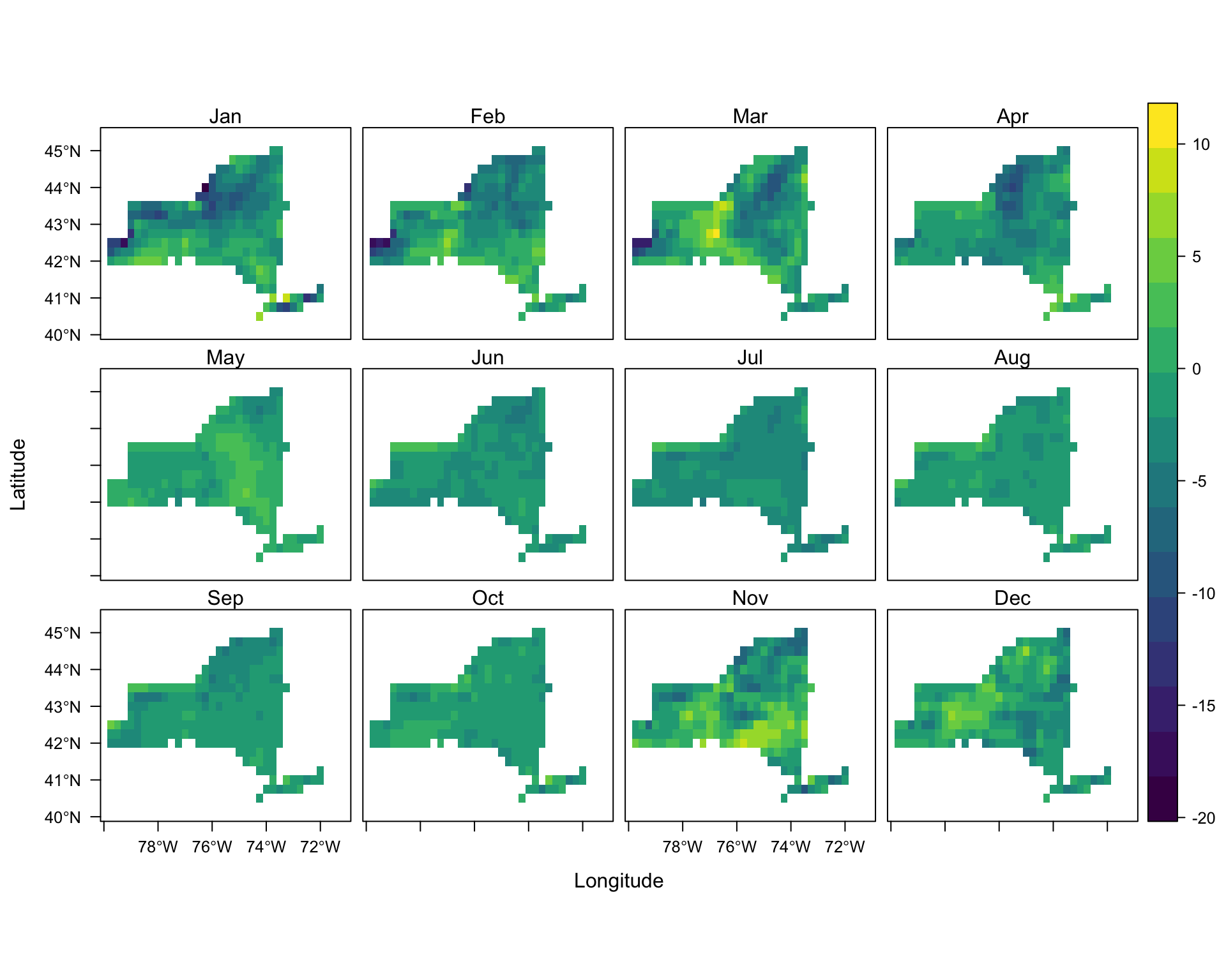
Difference between HRRR and ERA5 - Monthly Maximum Temperature
monthly_max_Diff_brick=brick(monthly_max_Diff)
names(monthly_max_Diff_brick)=ls_names
levelplot(mask(monthly_min_Diff_brick,ny_bound),
          col.regions=viridis)
Conclusions
As the result of this study shows, ERA5 model demonstrates a remarkable ability in generating temperature dataset, as a climatological variable, in comparison to HRRR model. Although HRRR model has much finer spatial resolution which supposes to help in building a more powerful model, the output of ERA5 model is proved to be closer to the reality. This statement is verified by comparing the dataset provided by the models with the dataset measured at the weather stations. There are two points noteworthy here. First, looking into the difference plots, one find that the range in difference in pixels of maximum and minimum rasters are much wider than the range in the average case. Although it complies with our decision in picking the resampling method, it also indicates that maybe comparing models by these measures are not accurate enough, as we may compare their outliers. Therefore, maybe looking into 10th and 90th percentiles of pixel values (for example) be a better criterion. Moreover, reanalysis models take into account the ground observations (e.g. weather stations) as well. So, maybe looking into a ground truth other than weather stations, yields results with less bias.
References
https://rda.ucar.edu/datasets/ds083.2/docs/Analysis.pdf
http://home.chpc.utah.edu/~u0553130/Brian_Blaylock/hrrr_FAQ.html
https://confluence.ecmwf.int/display/CKB/ERA5
http://home.chpc.utah.edu/~u0553130/Brian_Blaylock/cgi-bin/hrrr_download.cgi
https://confluence.ecmwf.int/display/CKB/How+to+download+ERA5
https://www.ncdc.noaa.gov/cdo-web/datatools/lcd